About the rebranding
EMUN is an Argentine company selling electrical and lighting products to wholesale and retail customers. This rebranding aimed to give the business a more professional, contemporary and recognisable presence, with trust and efficiency at the centre of its positioning.
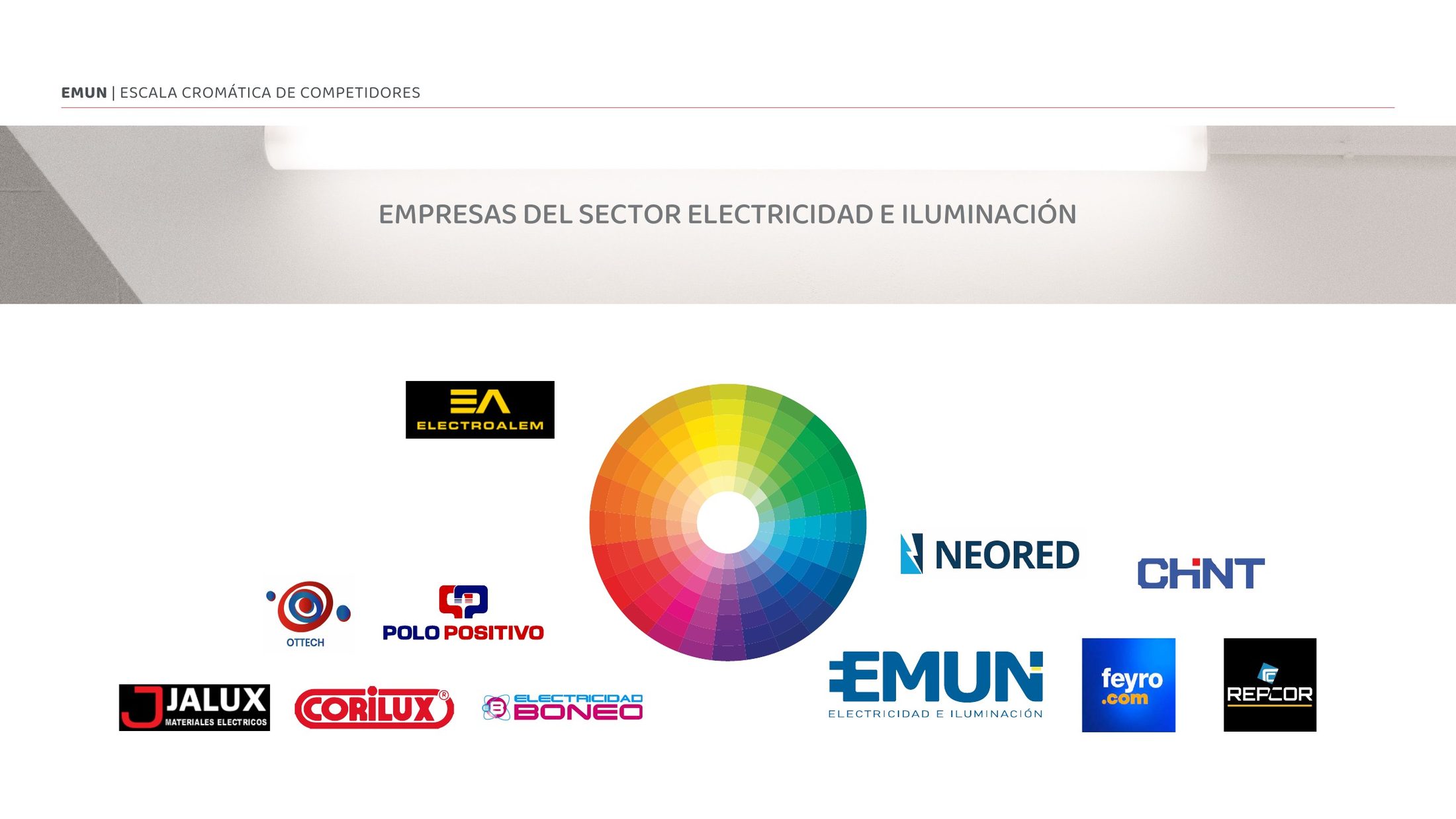
The process began with an exploration of brand personality and a review of colour use across the electrical and lighting sector. These references informed a visual direction that balanced technical clarity with an accessible, energetic character.
A redesigned logo
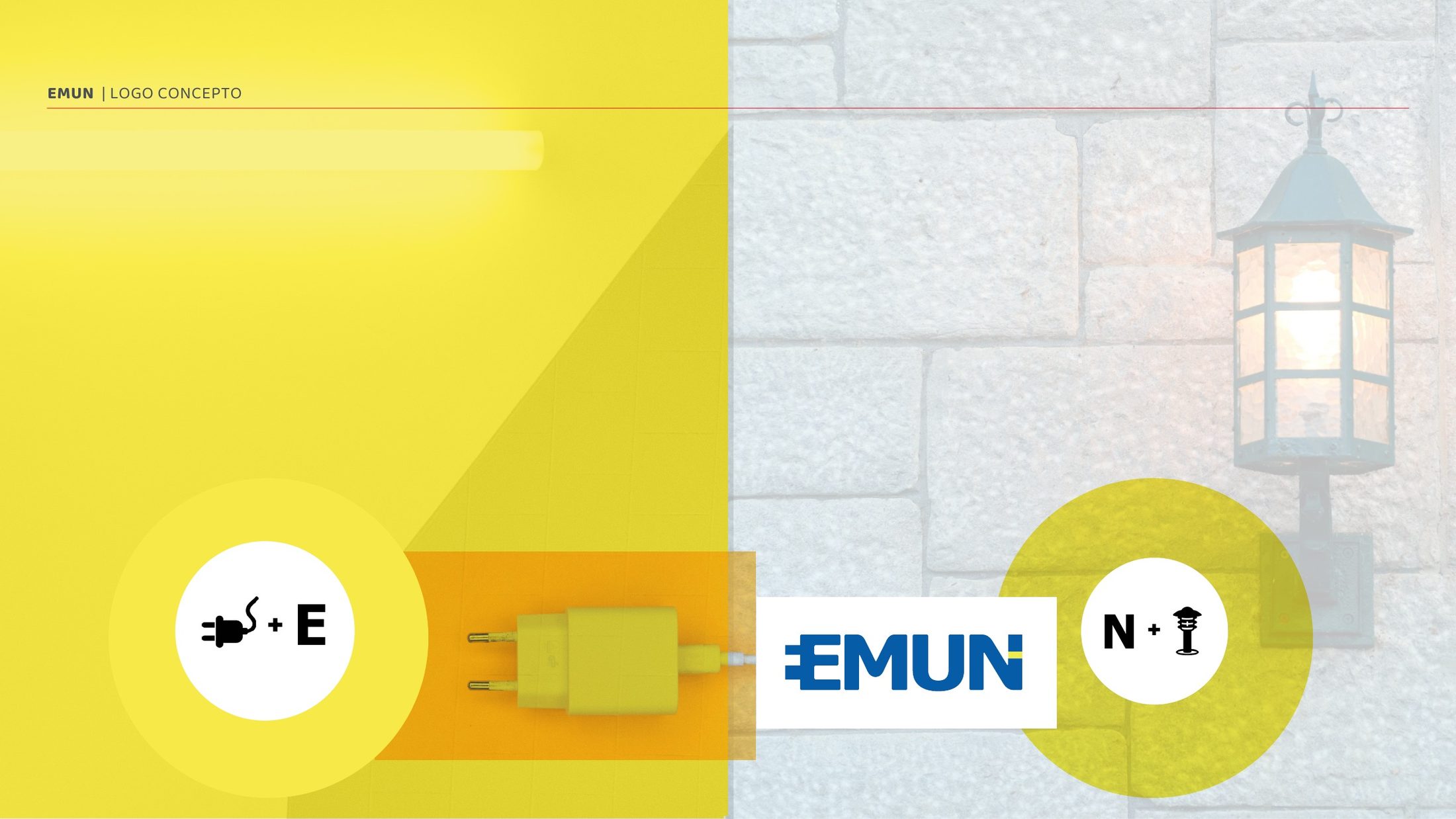
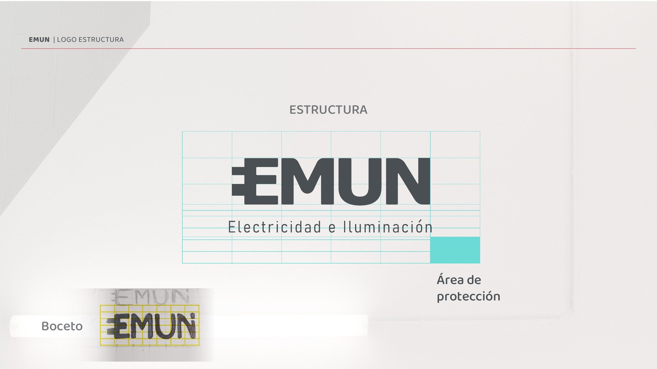
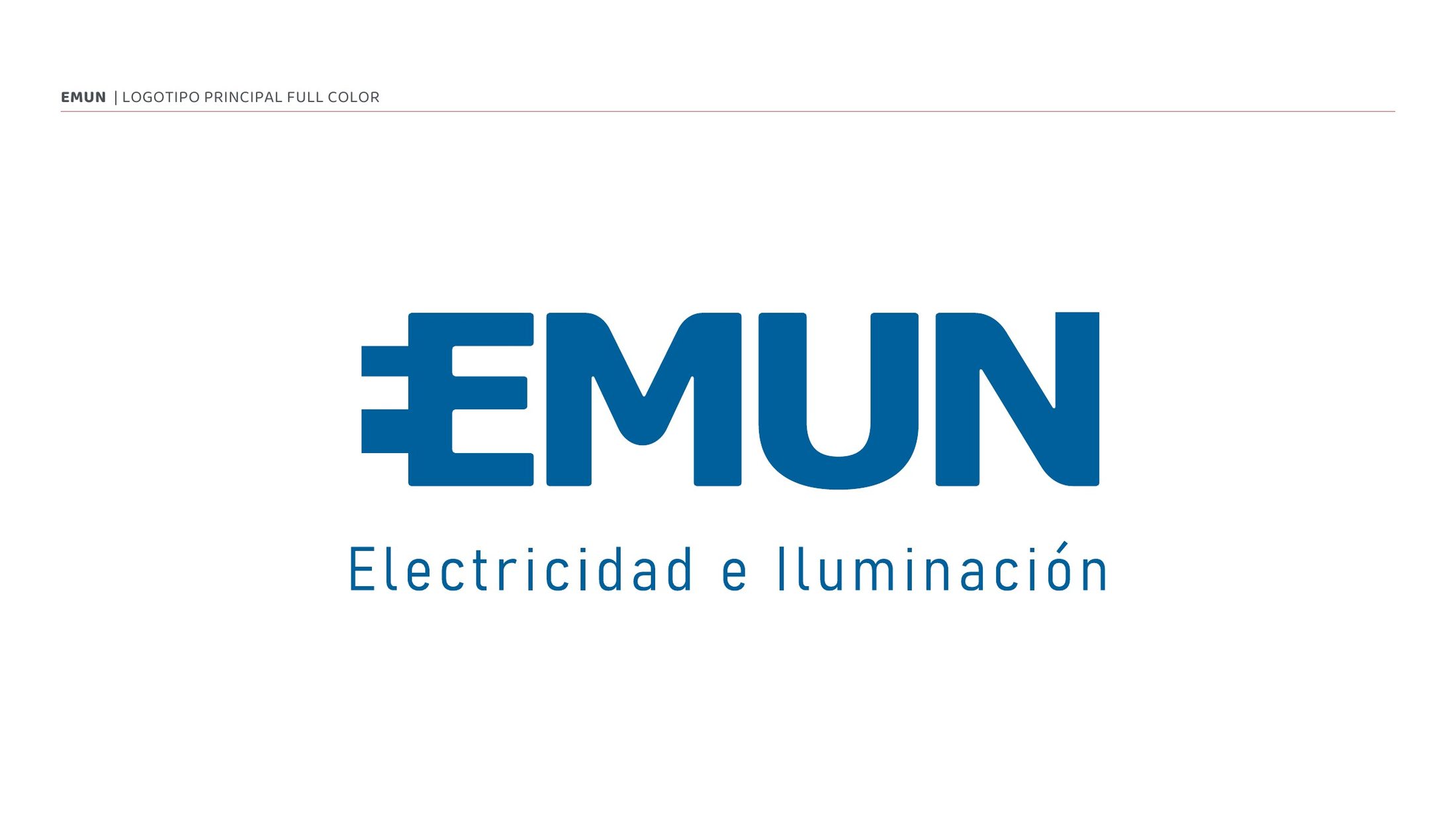
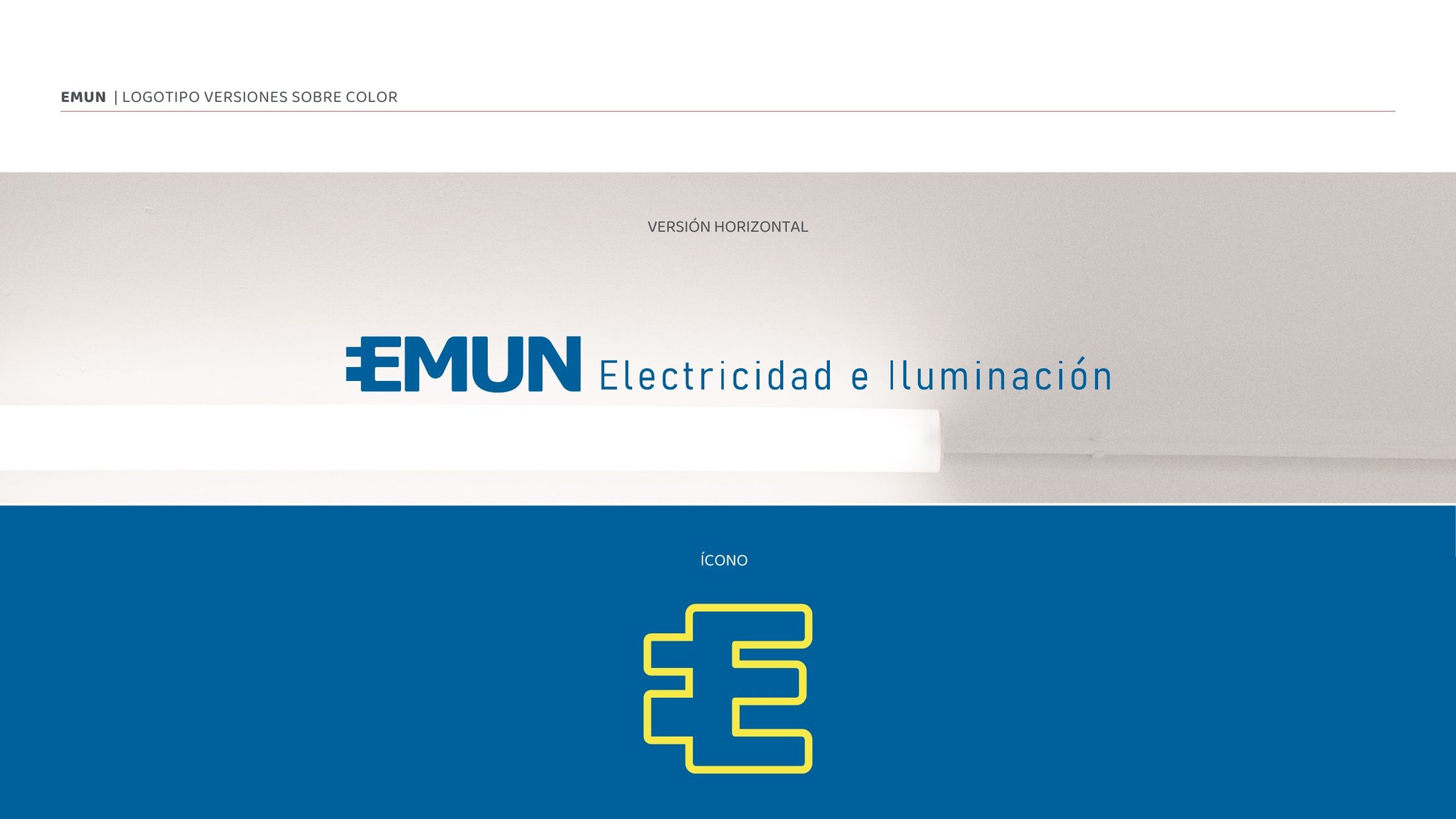
I designed a new logo bringing together electrical and lighting references with the brand’s letterforms. Its compact symbol works within the wordmark or independently as an icon.
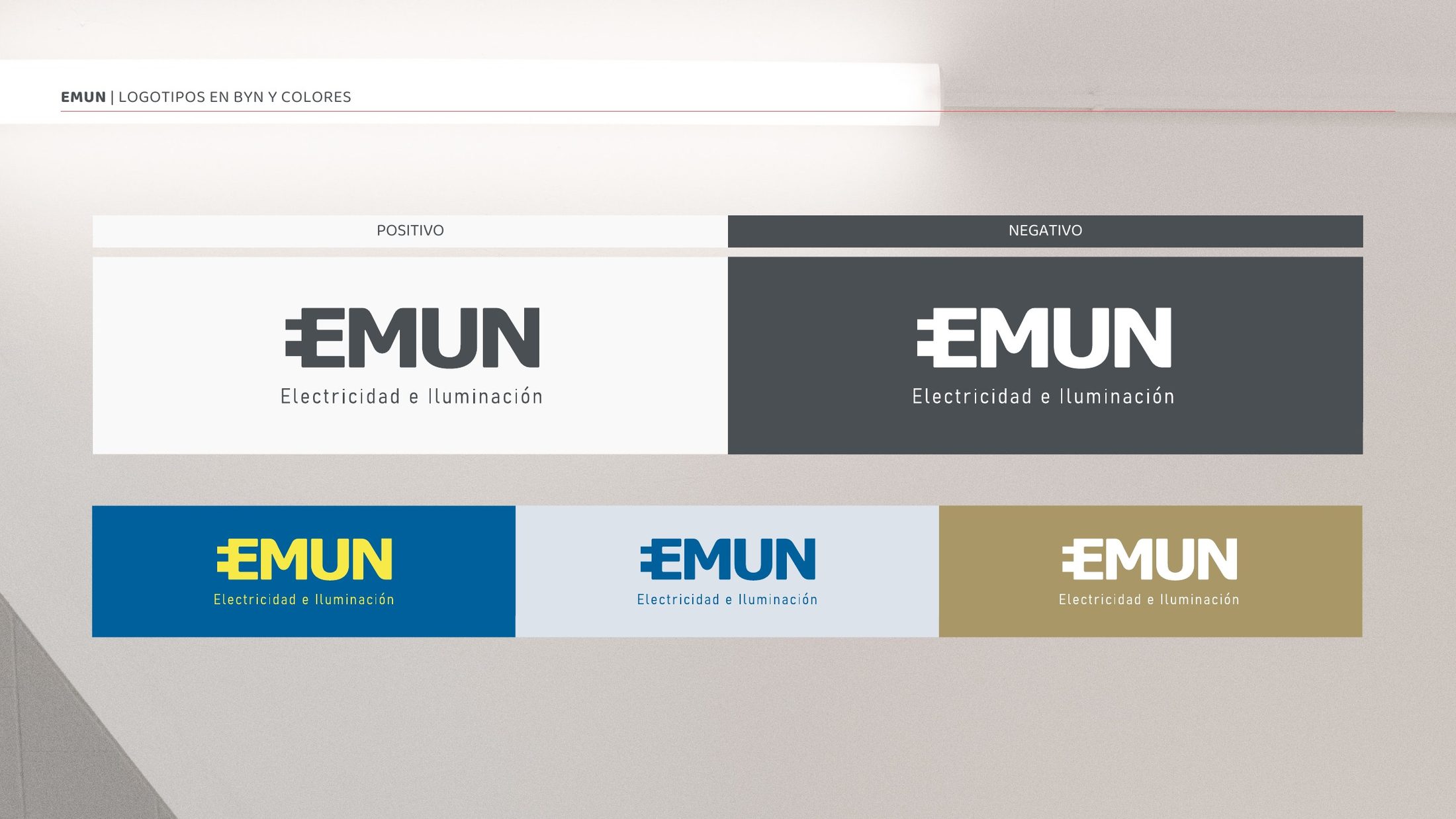
The guidelines document logo construction, clear space, horizontal configuration, monochrome versions and use on different backgrounds, supporting consistent application across print and digital formats.
From symbol to visual system
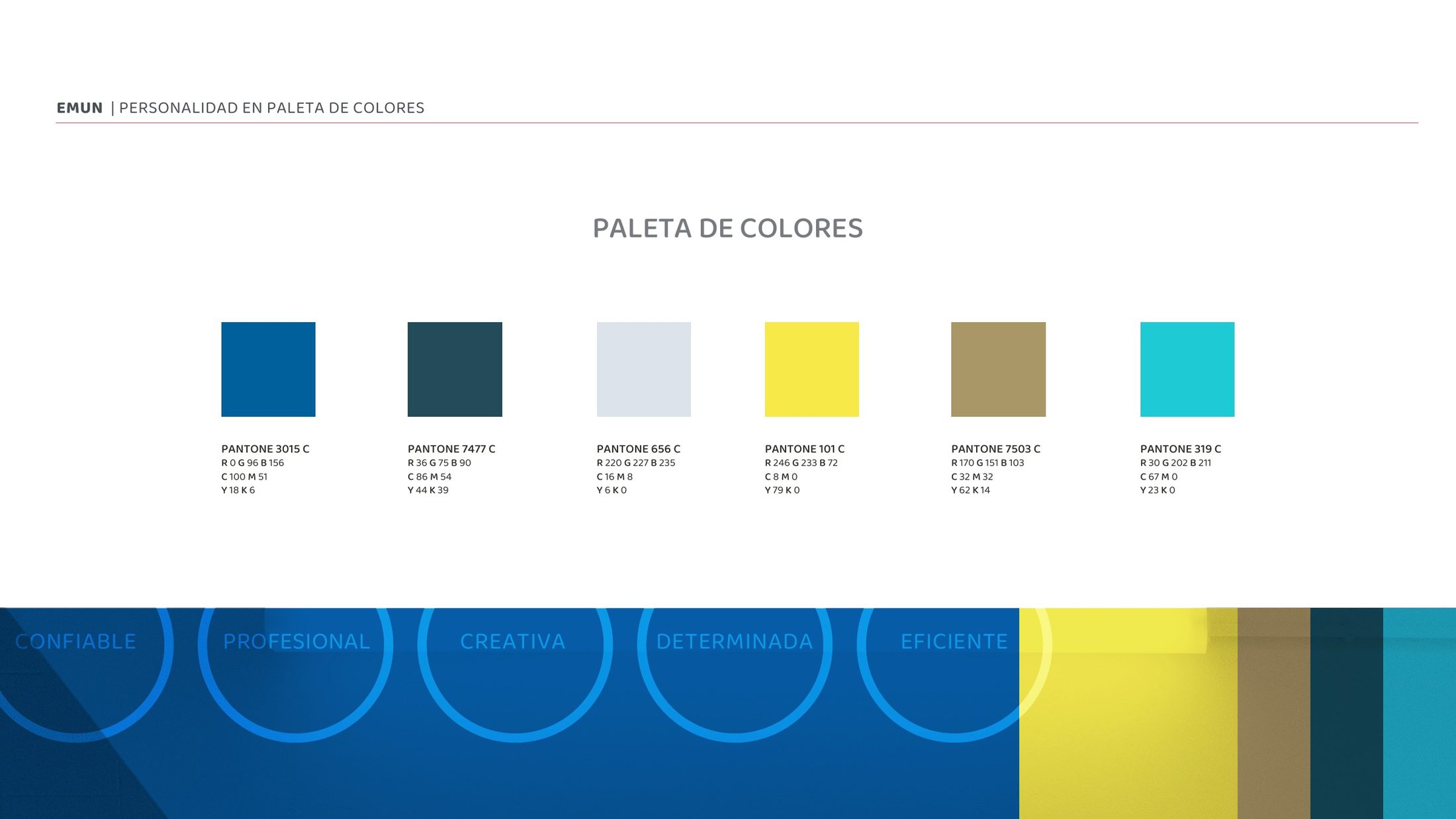
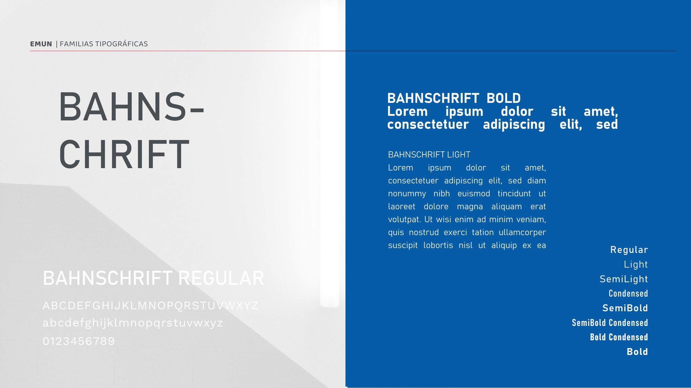
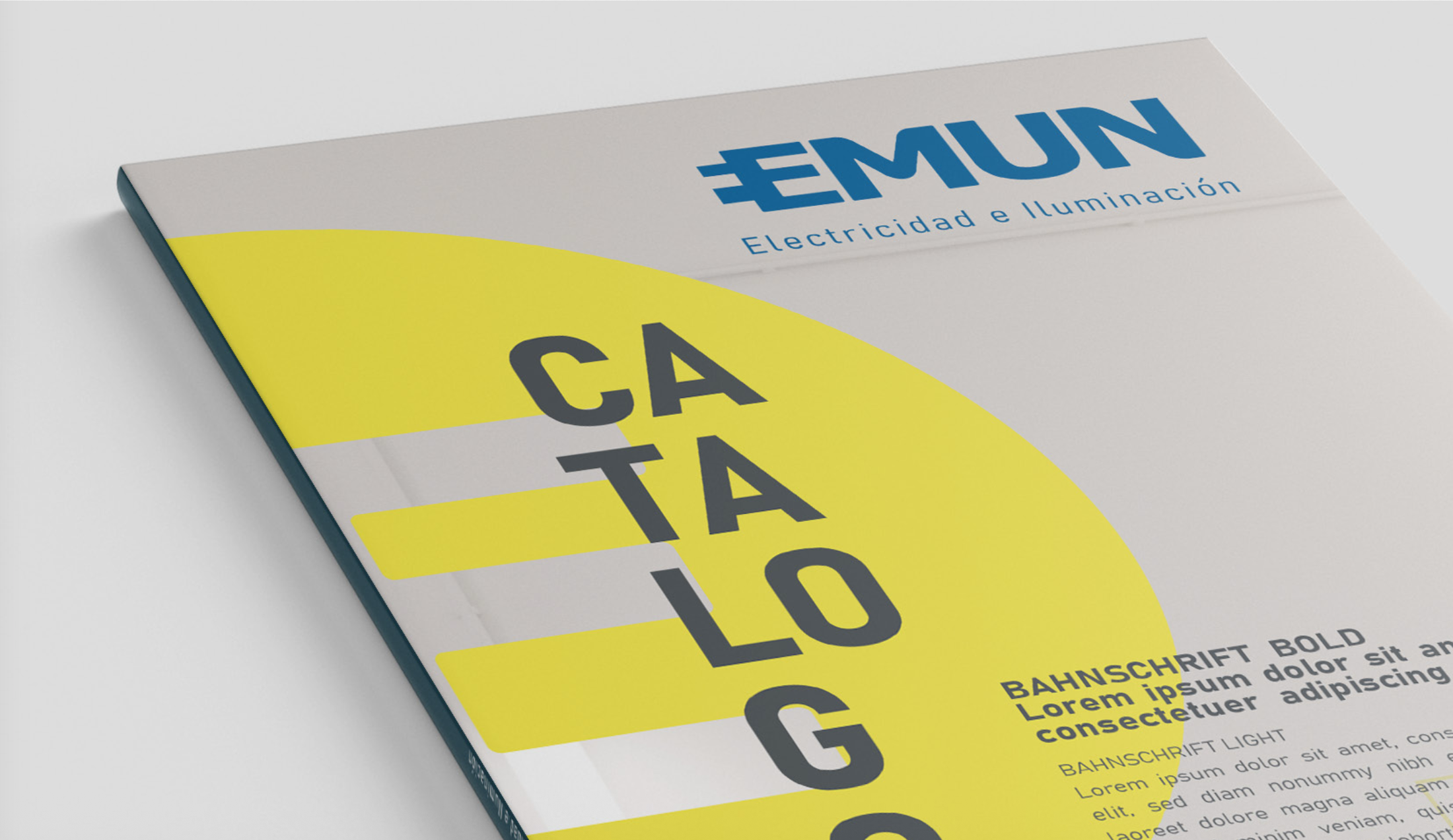
Blue and yellow anchor the identity, supported by a broader palette. The Bahnschrift type family provides a consistent structure, with different weights and condensed styles for headings, descriptors and supporting information.
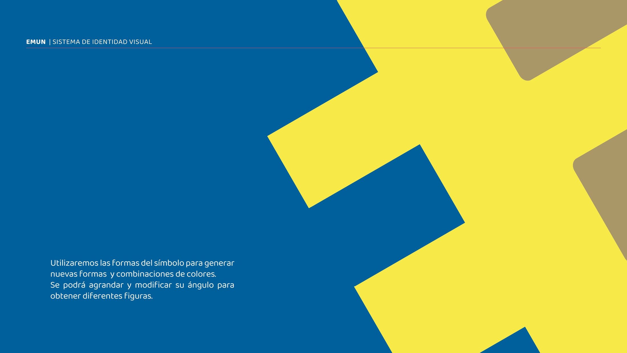
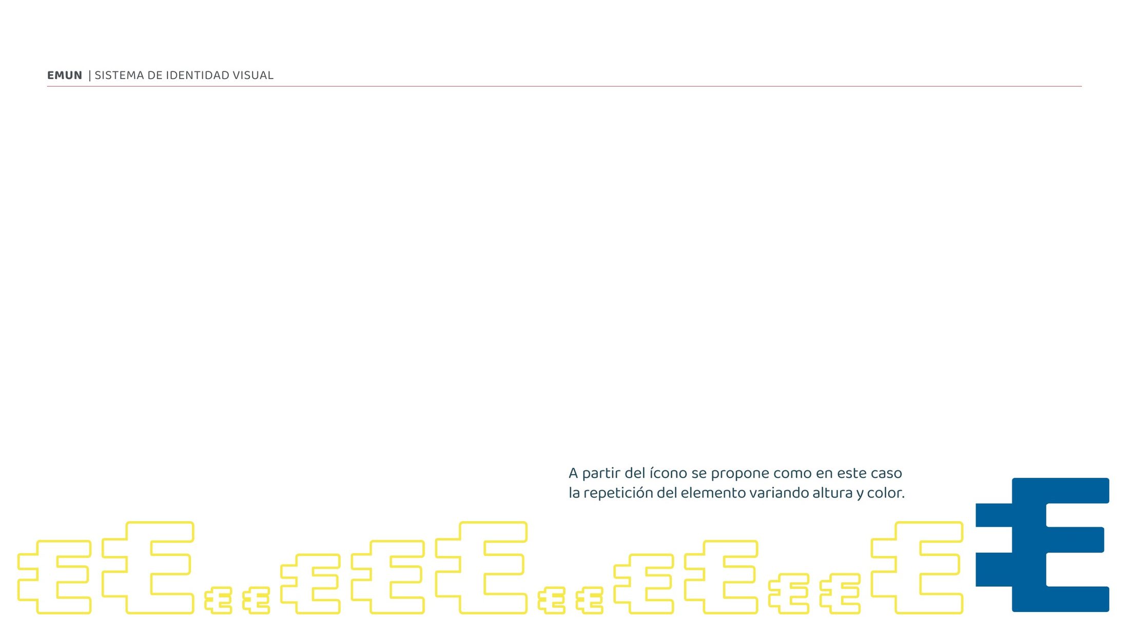
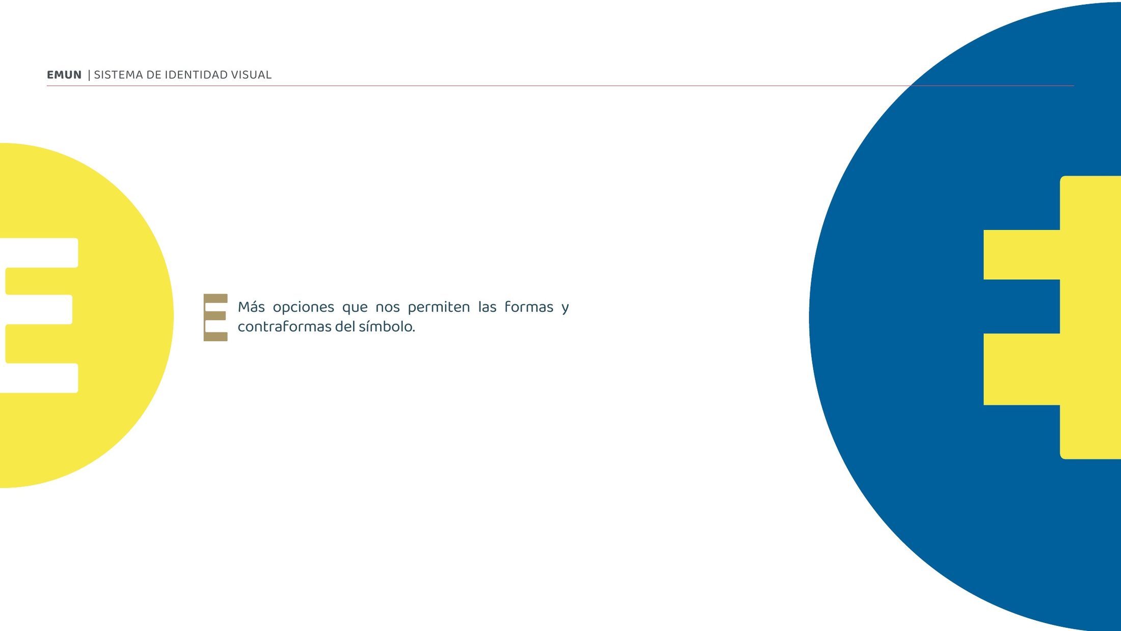
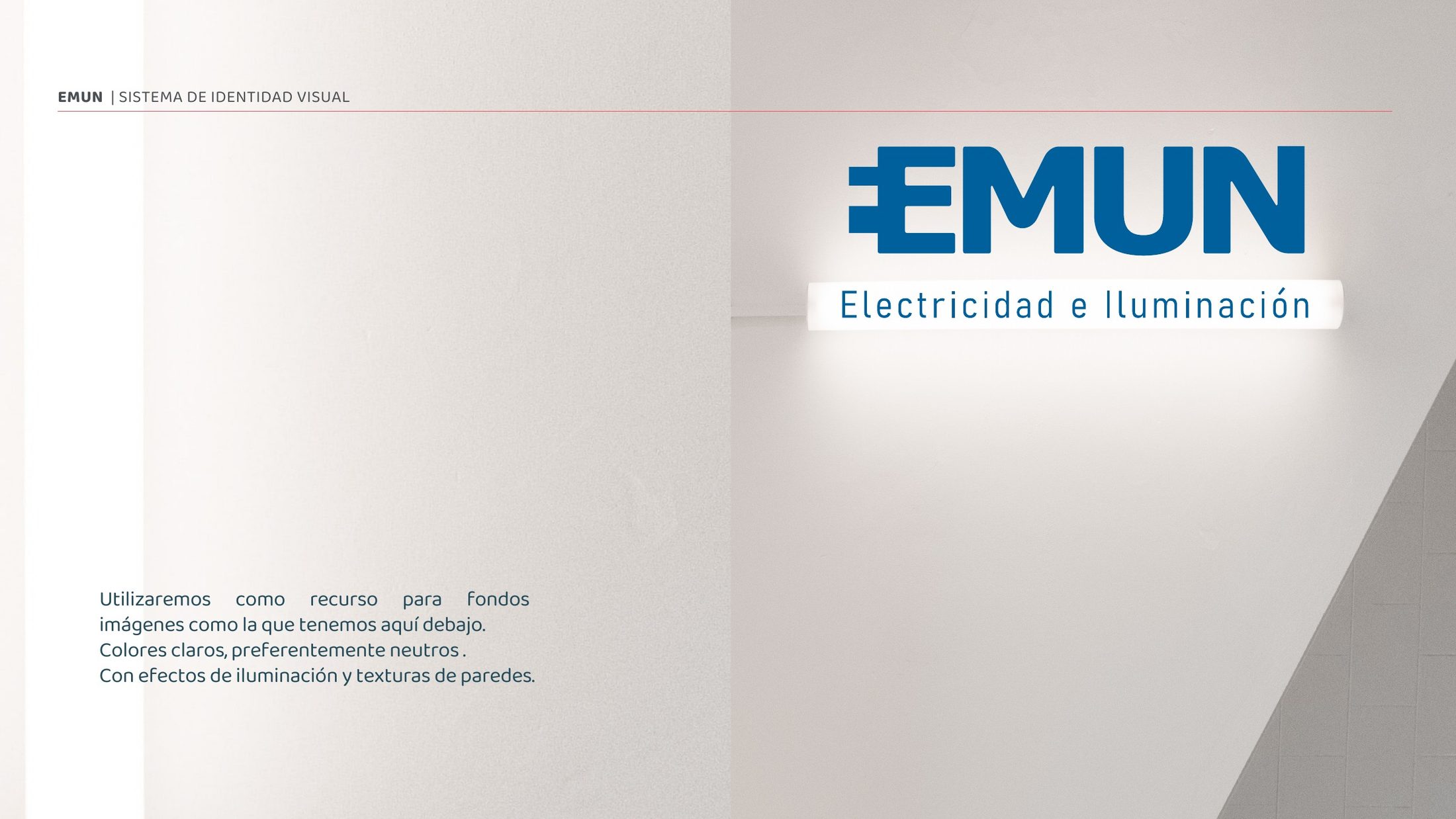
Enlargement, rotation, repetition and negative space turn the symbol into a flexible graphic language. Light, neutral surfaces and architectural textures provide a photographic context connected to the company’s products.
My part and applications
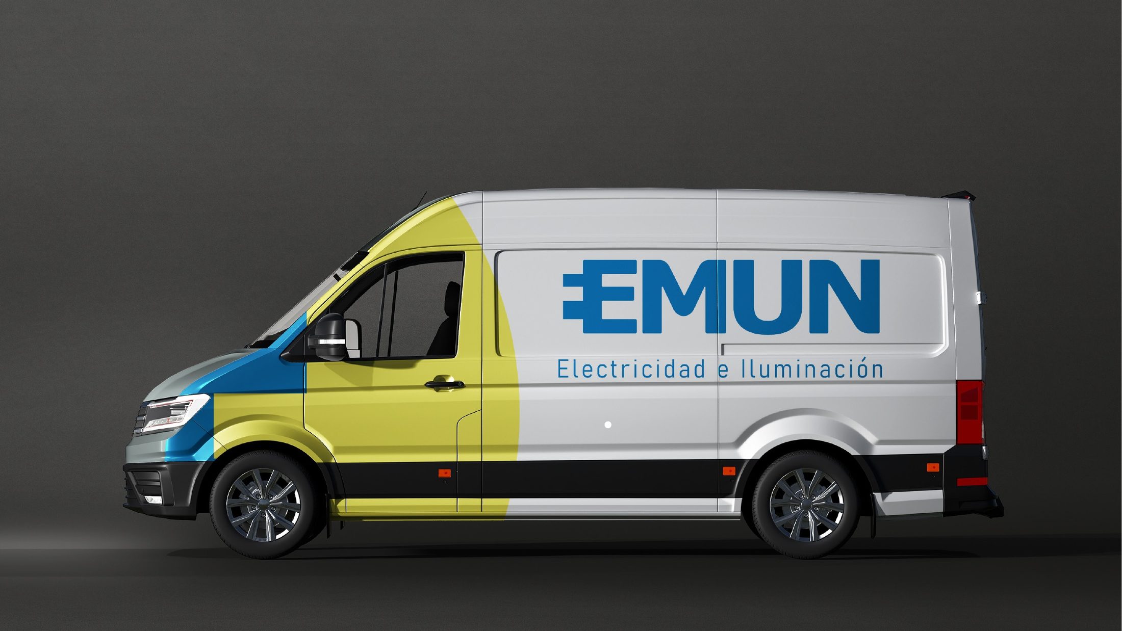
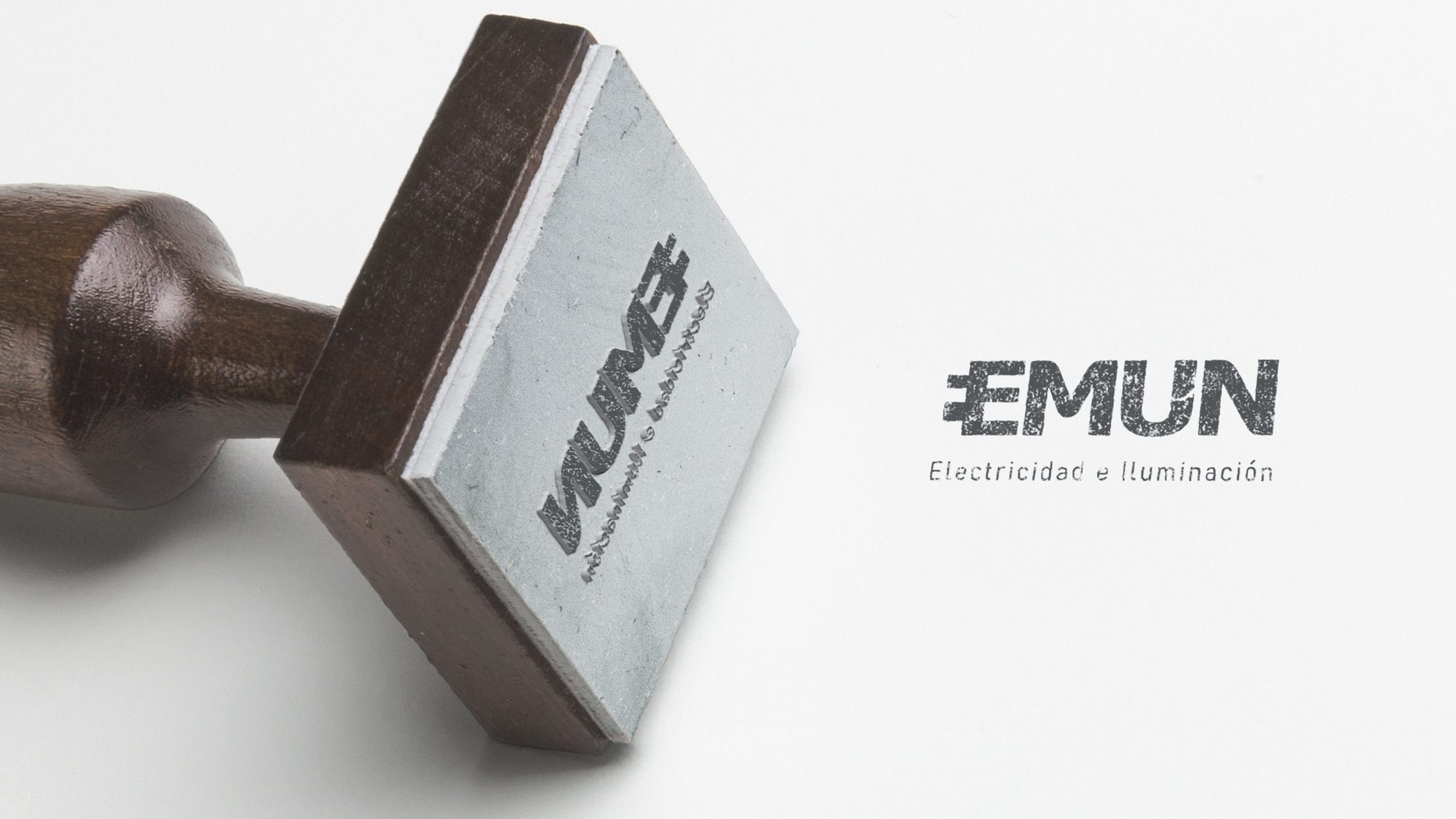
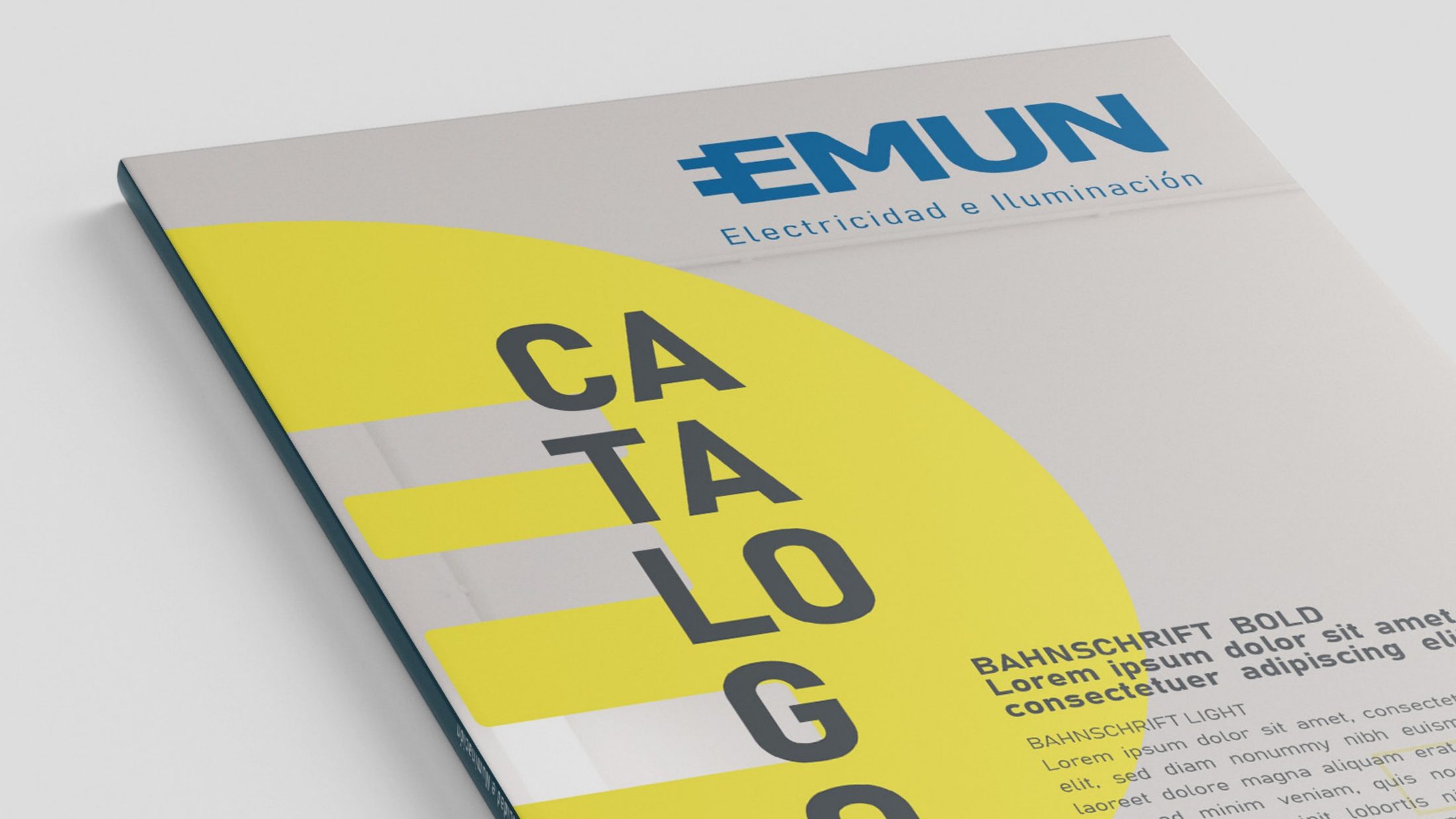
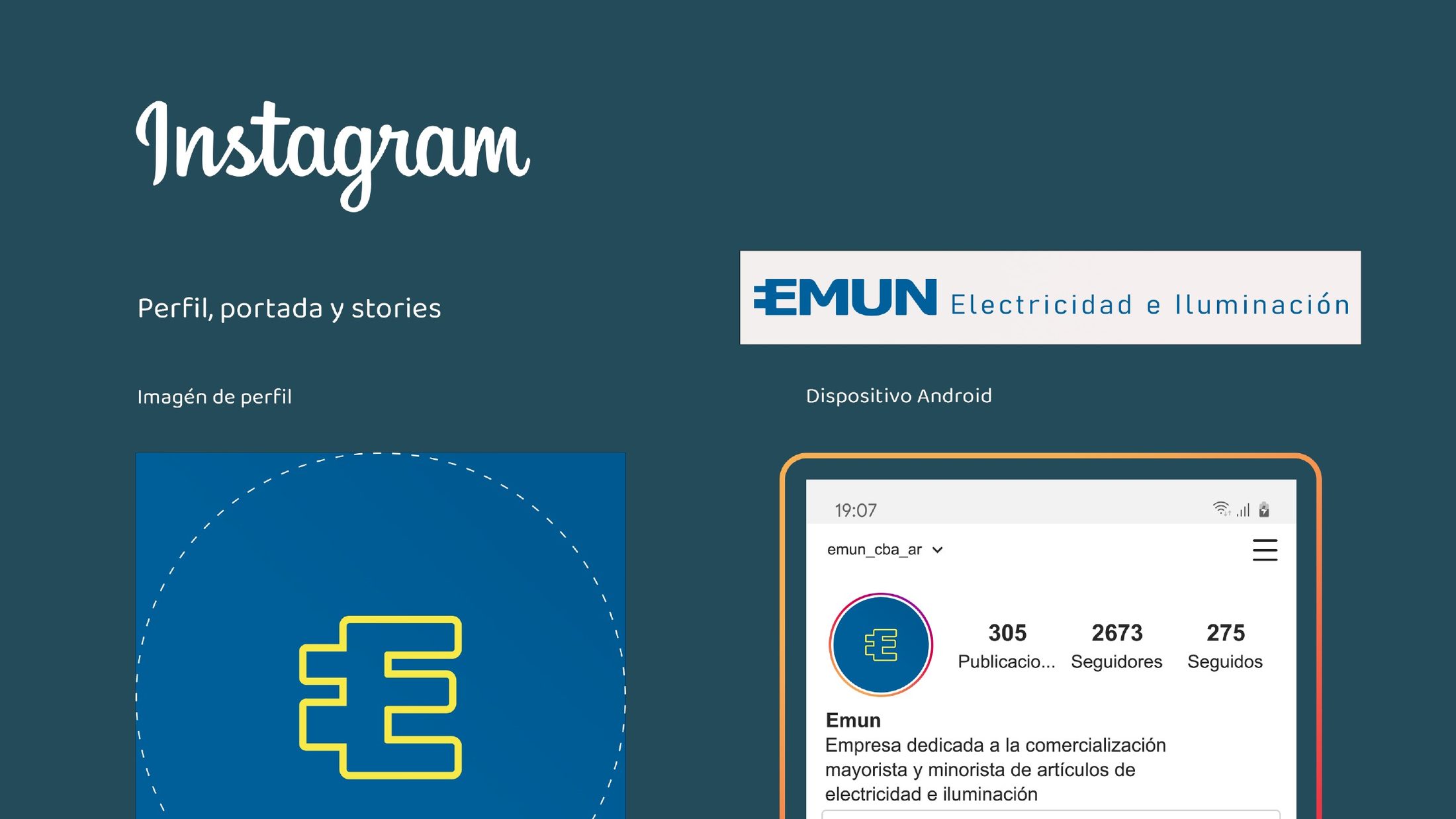
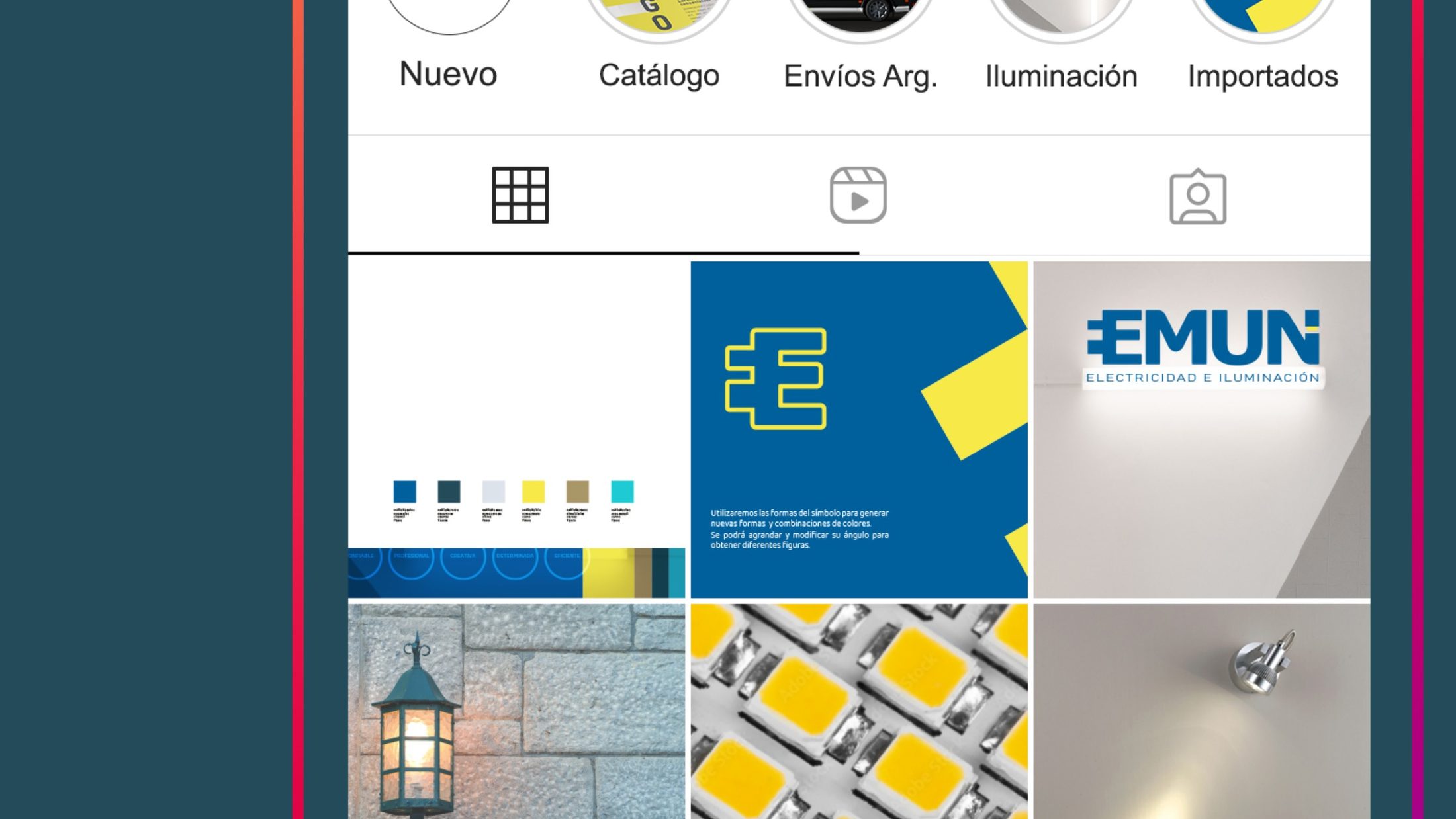
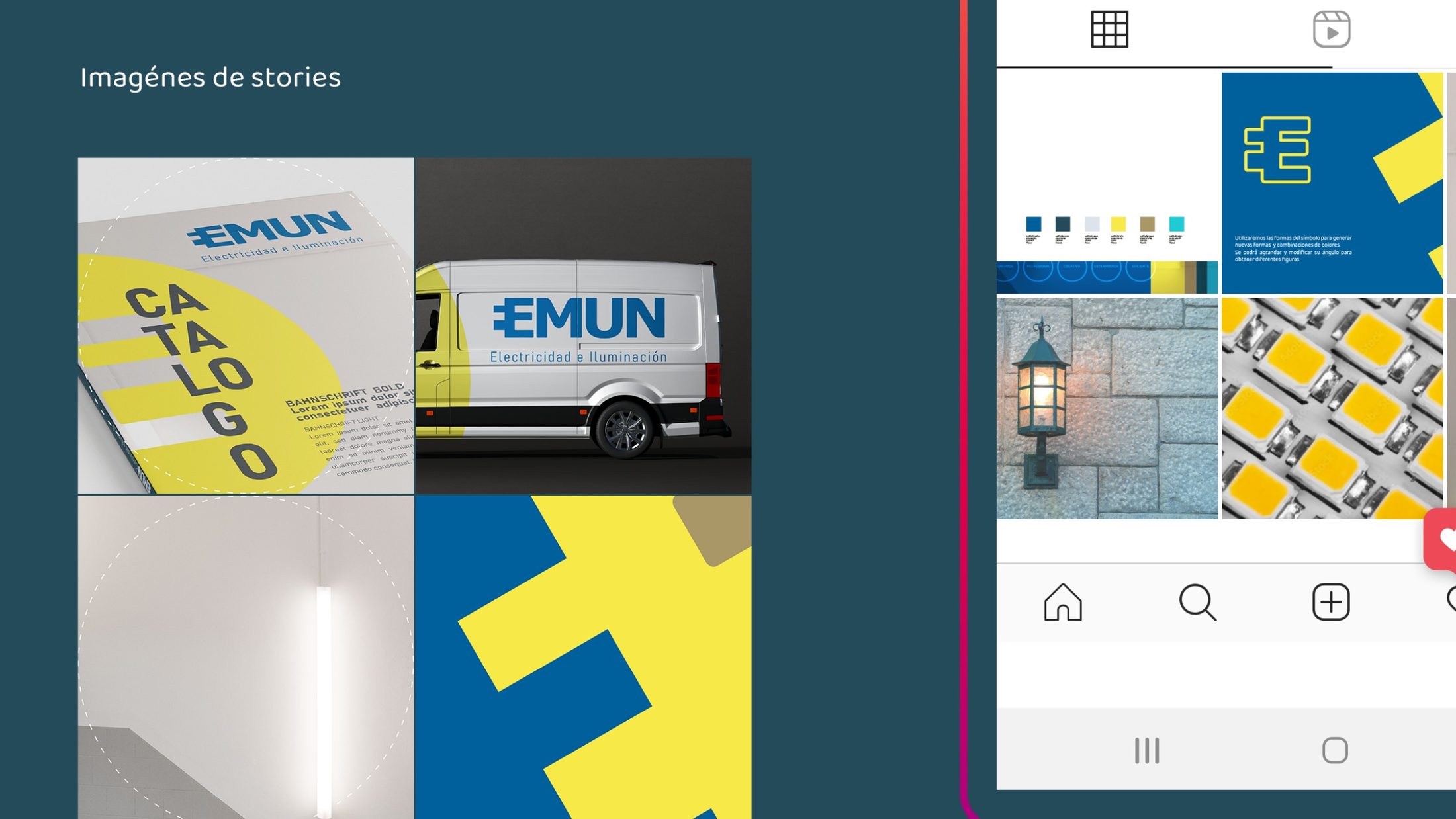
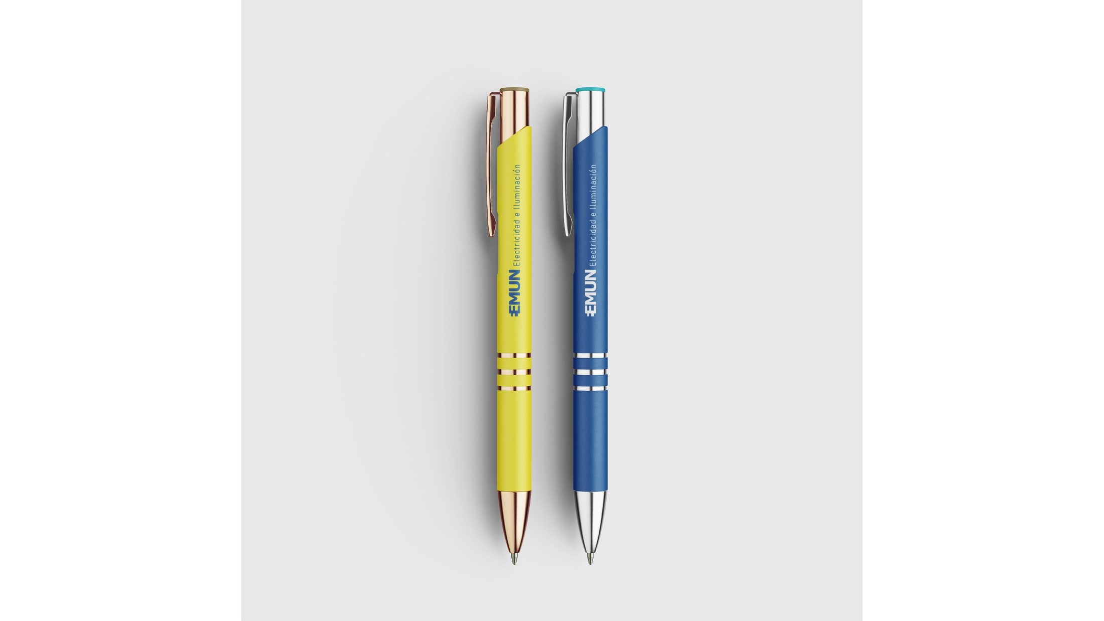
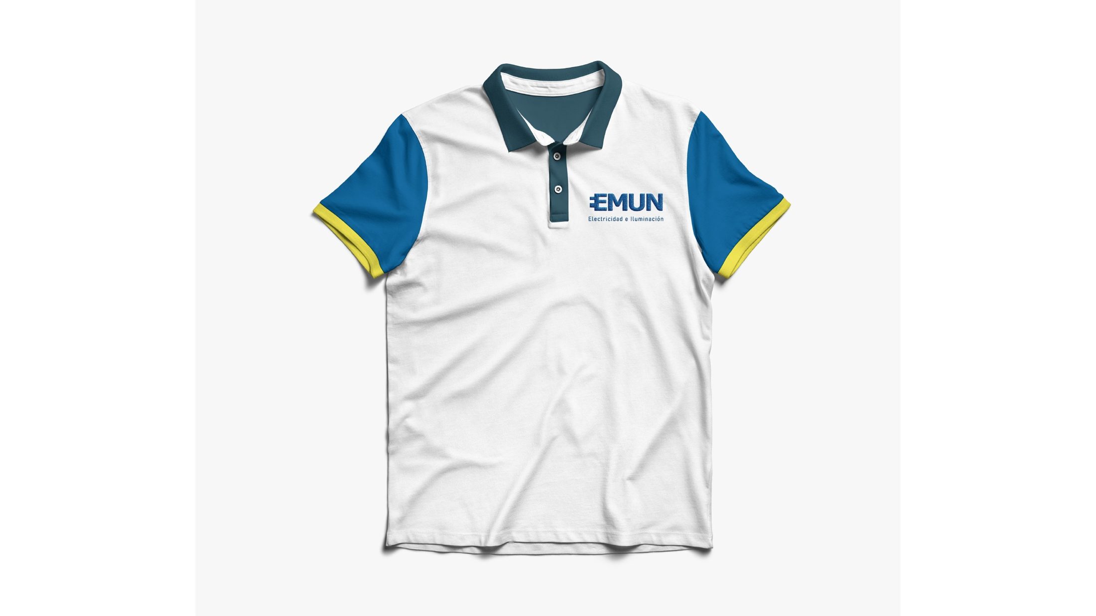
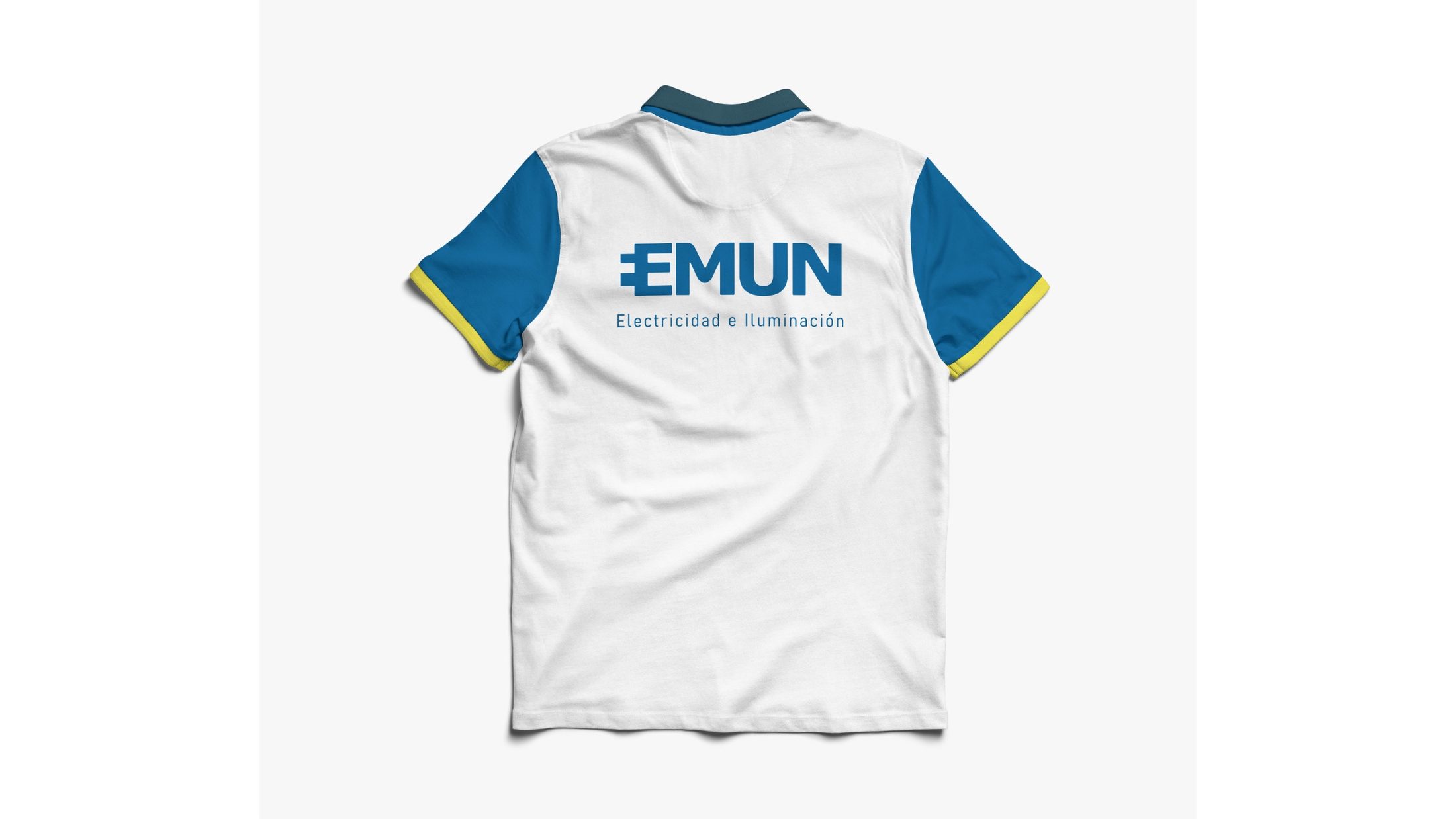
My work covered the rebranding, logo redesign, colour and typography, graphic language and identity guidelines. I developed applications and proposals for a product catalogue, Instagram profile, feed and stories, company vehicle, stamps, stationery and uniforms.
The gallery follows the project from research and logo development to these applications. Mockups illustrate the proposed uses of the system across different scales and contexts.
Project link
Credits
Brand identity, print materials and applications: Gina Marin
Client: EMUN